January 30, 2012
How To Choose the Right Sign Colors

Your client just said “we are re-designing our logo for our new locations, and we’re wondering which colors are best to use for on our channel letter sign for this type of business.” What is your answer?
As a signage professional, you need to know the basics about the most common colors and their associations. Why? Because choosing the correct color(s) can have a substantial effect on your client’s sign effectiveness. Subsequently, that will affect the number of future sign referrals your client will send back to you. Your client’s sign effectiveness is too important to leave to chance. And we don’t mean the simple color issues, like making the sign have good contrast to the client’s substrate.
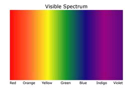
We mean the common psychological associations with basic sign colors, and how you can use that knowledge to help your clients with a more effective logo and sign. These principles carry over to all types of signage – not only channel letters. Here are the basic color spectrum chart, and then a table listing some basic colors and their associations:
 |
|||
|
Color |
Associations |
Example Businesses |
|
|
Blue |
|
Banks, financial companies, hospitals, insurance companies, retailers, medical, government |
|
|
Green |
|
Garden stores, Nurseries, Spa, Lawn care products, Real estate, Grocery/food store, Construction, Golf |
|
|
Red |
|
Warning signs, restaurants featuring meat dishes, fitness center, gym |
|
|
Brown |
|
Legal practice, trail markers and directories, state parks, campgrounds |
|
|
White |
|
Pharmaceutical companies, Financial companies |
|
So, if your client is re-designing their steakhouse channel letters, which colors should they use? Clearly, red should be incorporated into the design even if it is not the primary sign color.

image010
Outback Steakhouse – Note use of Red
