June 6, 2014
Effective Sign Design From the Get-Go

If your client is starting a business, effective signage can be one of their greatest (not to mention most affordable) marketing tools. Channel letter signs, as well as others, are generally the first business impression a customer receives, so you want to make sure they are eye-catching, professional and clear. Of course, the key to a good sign is attractive company branding and design. So, from the get-go, you want to make sure your logo, fonts and colors will work well with any medium, from print, web to signage!
Logos What makes a logo successful? Well, it needs to be recognizable, unique and memorable. You want your clients to have a logo that is immediately associated with their business and is sufficiently distinct that it is not confused with any other business. Simplicity is also a good rule of thumb with logo design. Logos need to be scalable, so they look clean and consistent when seen small, as in a social media icon, and when seen large, as in a channel letter logo box on the side of a building. The simpler the logo, the easier this is to accomplish.
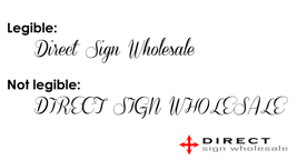
Fonts Serif and sans serif fonts are the most commonly used font families in graphic design and signage. This is because they’re versatile, sleek and easy to read. Script and novelty fonts can be used successfully, but you must be careful to consider legibility at different sizes and distances.
It’s generally recommended that you advise your clients to avoid using ALL CAPITAL LETTERS and instead opt for a combination of uppercase and lowercase characters, as we discussed in a January 2014 blog post. This guideline is especially true if you choose a script or novelty font.
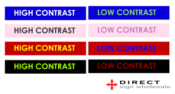
Colors Think back to your school days, because that classic color wheel is going to come in handy once again. By following the rules of color schemes, you can select high-contrasting colors that look nice together, increasing the visibility and aesthetic of your channel letter sign. Here is one great tool we’ve shared before – with the Color Scheme Designer 3, you can easily experiment with color combinations and adjust hues and shades to best fit your brand’s image. If you’d like to review the basics of color combinations and how to advise your client on which colors to use, our March 2013 blog post has some examples and info.
What are some of your tips for brand and signage design when consulting your customers?