March 30, 2015
A Quick Idea for Increased Sign Effectiveness

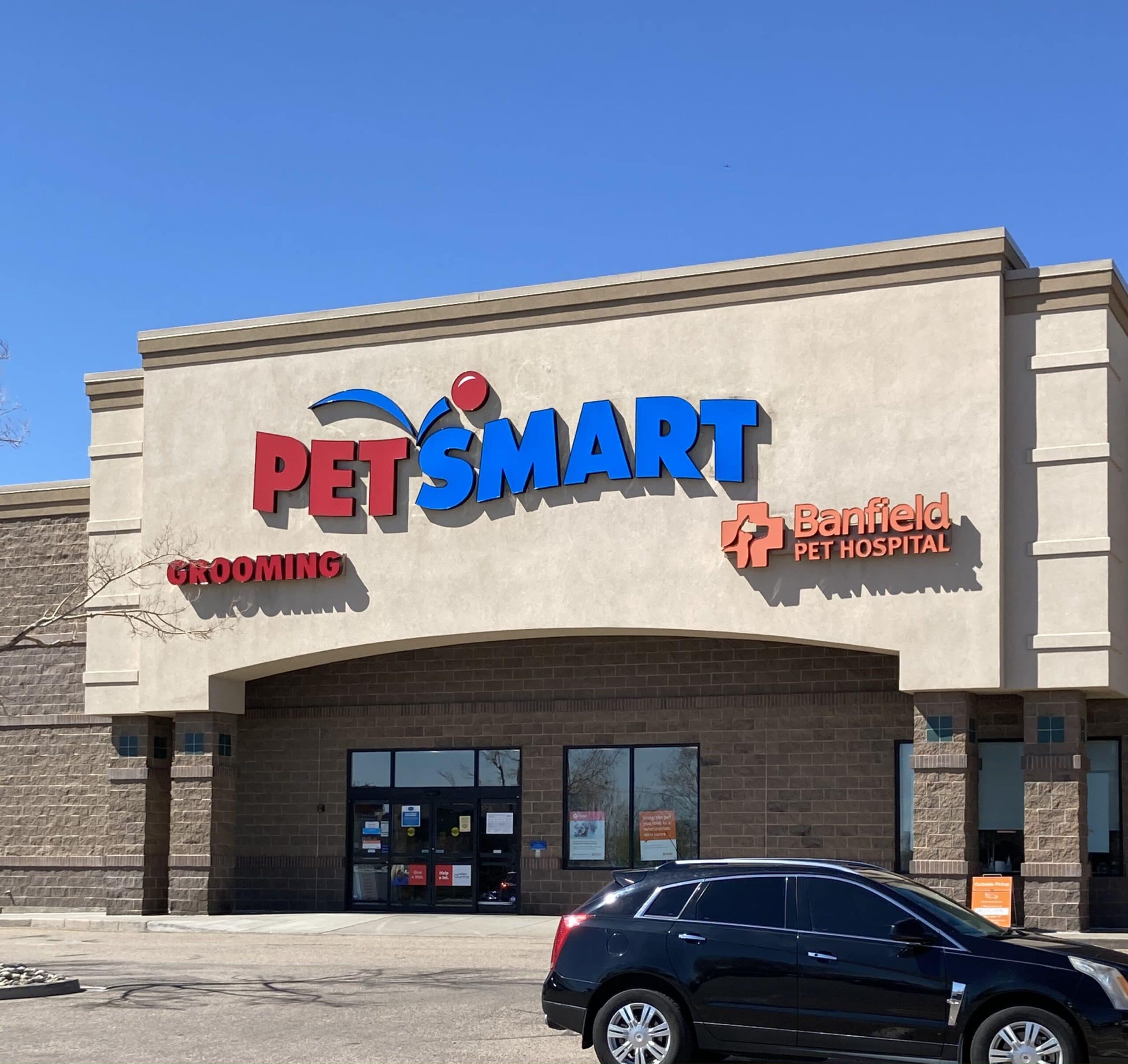
What is a simple way to increase the probability that a channel letter sign will be effective?
Here is one easy way: make sure your client’s sign ranks high on the legibility scale. Not the readability scale, the legibility scale. They are two different things.
Here are two quick definitions: legibility is the ability for a person to read something without effort. The typeface does not require a mental “translation” – it is quickly comprehended.
On the other hand, readability is defined as how well a combination of letters are read within a larger body of text.
One potential rule of thumb: sans serif fonts tend to be better for legibility and serif fonts tend to be better for readability.
Here is a relevant quote: “letterforms composed of unique shapes, artistic formations, excessive ornamentation or other novel design elements cause the reader to have to process what they are looking at first instead of just taking in the message.”
So if your customer presents you with a sign idea that is heavily “artistic”, ask them to reconsider the value of that design. Productive business signs communicate quickly in a competitive environment. Ask which would your customer prefer – an “artistic” channel letter sign or a 25% increase in foot traffic?
Plus, there is another reason to stick with basic fonts for channel letters. Standard block serif fonts tend to have enough interior space for sufficient LED module placement. Artistic fonts often have small interior channels which prevent a sufficient LED mounting area. Then your customer will have to approve a change order prior to production, which will delay their sign installation. Not a good situation.
So stick with the font basics for signage! It will pay off for your customer.
