November 16, 2015
Why Red Should be on Your Night Visibility Color List

Why Red Should Be on Your Night Visibility Color List
Your client just asked you for a color that has good night visibility. What do you tell them? A while back, we discussed white as a high visibility night color. Red is another contender. But why? Here is the answer. The cones of the human eye are clustered in the center of the pupil. The eye has three types of cones – red receptive, blue receptive and green receptive. Human Eye
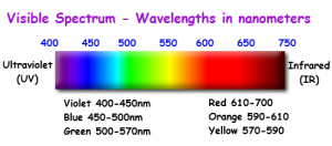
The cones are more sensitive to colors that have longer light wavelengths such as red. The eye’s rods surround the pupil. Cones (which detect color) lie roughly in the center of the pupil. Our cones perceive light from about 570nm to 700nm, and provide us with our color vision. If the light drops below the cone minimum (570nm) we lose our color vision because our cones do not absorb light at these wavelengths. This is why when it’s dark outside you can perceive objects and shapes but not their colors. And since there is a higher proportion of red-receptive cones in the eye, red is one of the first colors to become visible in the dark. That is why companies who conduct much of their business at night (such as liquor stores, restaurants or night clubs) should strongly consider a red-illuminated color configuration on their channel letter design.
Keep red on your list for night channel letter effectiveness. By the way, this is why some cars have red-illuminated instrumentation gauges. Superior night visibility.