March 27, 2013
The Secret of Effective Sign Color Combinations

The Secret of Effective Sign Color Combinations
Remember the color wheel from grade school? It was a distant memory for me, but revisiting it actually turned out to be productive. The color wheel is comprised of primary, secondary and tertiary colors. So how do those color categories break down? In a nutshell, the primary colors are blue, yellow and red.
All other colors are derivatives of these three primary colors. Then, the secondary colors are made by mixing primary colors. Orange is made by mixing red and yellow, for example. Or green is made by mixing yellow and blue.
Last, the tertiary colors are made by mixing a primary color with a secondary color. Red-Orange for example is a tertiary color. The color wheel below shows the primary, secondary colors, and tertiary colors:
So far, so good. Two more brief definitions and we’ll apply this to signage. The first is analogous colors. Those are colors which sit next (or close) to each other on the color wheel, like blue and green. Then there are complementary colors. Complementary colors sit across from each other on the color wheel. Like red and green, for example. Here is the kicker: complementary colors create a visual punch when used next to each other. They intensify each other and also create an after image of the complementary colors on the viewer’s retina. Colors that sit next to the complementary color on the wheel are called “split complementary colors.”
So that brings us to how you can use this information to increase your customer’s signage effectiveness. Check out this channel letter sign:

Something about this channel letter configuration has always interested me – the red letters just seemed to be brighter than others I’ve seen. Now I think I’ve figured it out. Look at red and green on the color wheel above. Complementary colors – that is what provides the impact. Red letters on a green façade. Here is another example. Check out the logo on this AT&T sign:
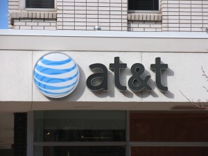
Not bad. The black letters certainly show against the light building façade. However, the logo itself does not make a strong visual statement. It blends somewhat with the white building facade. Not good. However, check this channel letter set by comparison.
Here is a similar AT&T sign on an orange-red brick façade:
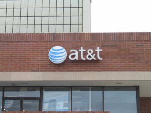
Suddenly the logo box is highly visible. What is up with that? Check the color wheel – blue and red-orange are split complementary colors. So you have the 1-2 punch of complementary colors on the wheel, and an opportunity to leave a sign afterimage on the viewer’s retina. Obviously a more desirable scenario for your customer’s sign. So another way to gauge the effectiveness of a potential sign color scheme is to use the color wheel, and compare the sign and façade colors to their respective wheel locations.
Complementary sign/façade color combinations will always have a strong presence – and your channel letter customer has more visibility and impact. All good.