April 26, 2011
Which Sign Color Combinations are the Most Effective?

You already know that a sign must have acceptable contrast to be effective.
But what are the best color combinations for both contrast and legibility?
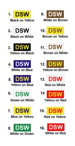
Check the chart below for a fast reference* Using these sure-fire sign color combinations will keep your client coming back to you for other signs.

TOP-SIGN-COLORS-4-11
These combinations are applicable to all signage types – not only channel letters.
Note one simple and consistent combination theme: contrast. Each letter set has a clear and distinct contrast from the background color.
Also, picturing the chart background color as the building façade color is helpful.
Then it is easy to select the correct combination. That puts you right in the effectiveness “kill zone” –you know the colors you’ve chosen for your client’s sign will work.
Note also that many of these combinations involve the colors yellow and/or red. As we covered in last month’s e-newsletter, those are high wavelength colors which are also more legible to older adults (see last month’s post for color wavelength information.)
Use this chart to make your client’s sign more effective. That will ensure future business from that client, and also encourage referrals.
*Claus, K.E. and Claus, R.J. Visual Communications Through Signage. Volume 1. Perception of the Message. Signs of the Times Publishing Co. 1974.
